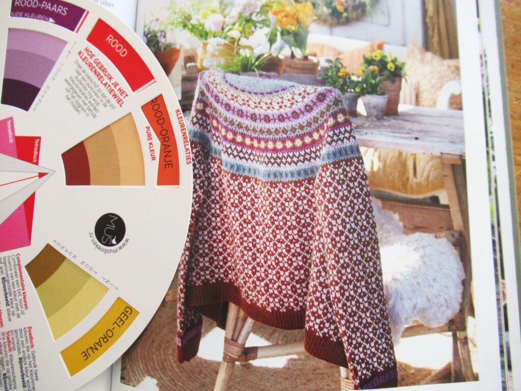
Hello! As I told you last week, I’m going to knit Helma, a stranded colourwork cardigan designed by Kristin Wiola Ødegård (picture above). I think it’s gorgeous – a beautiful all-over pattern on body and sleeves, a stunning yoke and an uplifting and harmonious choice of colours. The only thing is, the colours are not ‘me’. That’s not usually a problem; I substitute colours all the time. Only this time the pattern uses 9 different colours, and that’s a lot trickier than substituting 2 or 3.
Usually, I choose colours instinctively. For me, the easy way out in this case would be taking a neutral (like dark navy or charcoal, combined with off-white or light grey) as the main colour and throw lots of pinks and purples at it. In colour-wheel terms pinks and purples are analogous colours, i.e. from colour groups next to each other on the wheel.
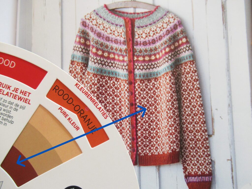
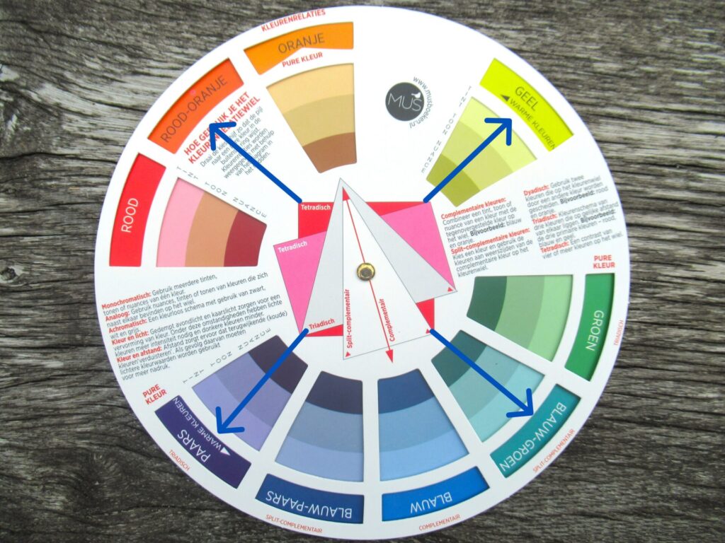
That would work, but the effect would be totally different from the original. How could I stay closer to the sample using colours I like? To find the answer, I dusted off my rarely used colour wheel in order to analyse the designer’s colour palette. The main colour is easy to recognize – it belongs in the red-orange group on the wheel.
From the same group, there is also a dark reddish brown and a very light kind of beige. But what about the rest? There seems to be some greenish blue, some purple, a yellowish olive. What kind of colour scheme is that?
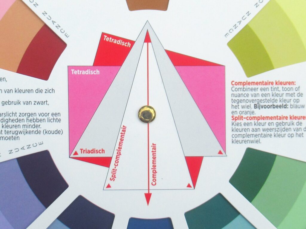
Looking at the centre of the colour wheel (picture below), colour palettes can be for instance analogous (the pinks and purples above). Complementary, combining colours from two groups opposite each other on the wheel like, say, red and green, or blue and orange. Or triadic, with colours from three different colour groups evenly distributed over the wheel (indicated by the corners of the grey triangle).
Studying Helma’s colours for a while, I discovered that the designer chose a tetradic colour palette, using colours from four different colour groups – the ones the corners of the red square in the picture below point at (I’ve added blue arrows from the corners outward to the colour-group names):
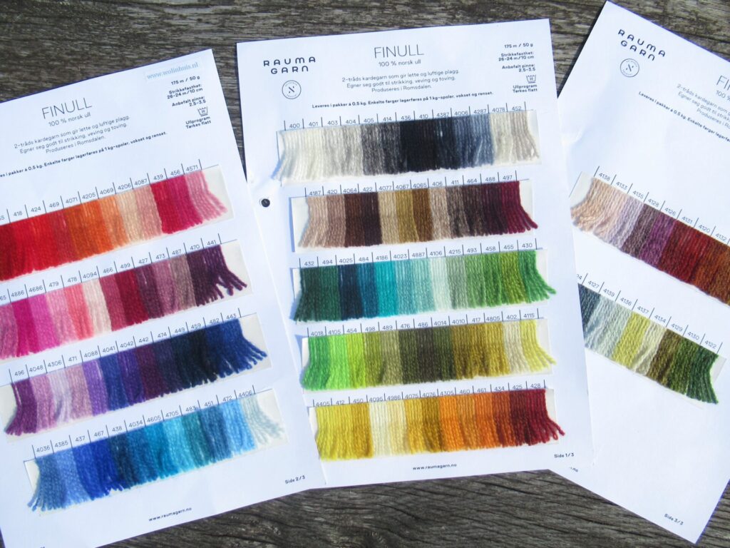
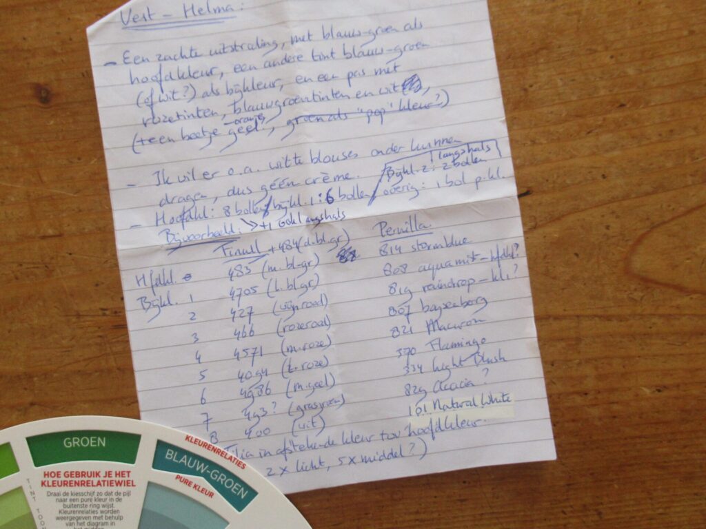
The original Helma has 3 red-oranges, 3 violets, 2 blue-greens, and one yellow. The colours are vivid, and there are 2 dark ones, 2 light ones and 5 of a medium value. All in all quite a complicated colour palette. Would I be able to recreate it in colours I like? I was thinking of using Rauma’s ‘Finull’ yarn and had the shade cards at home.
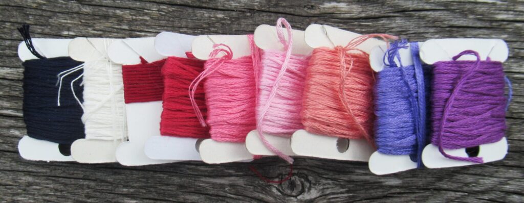
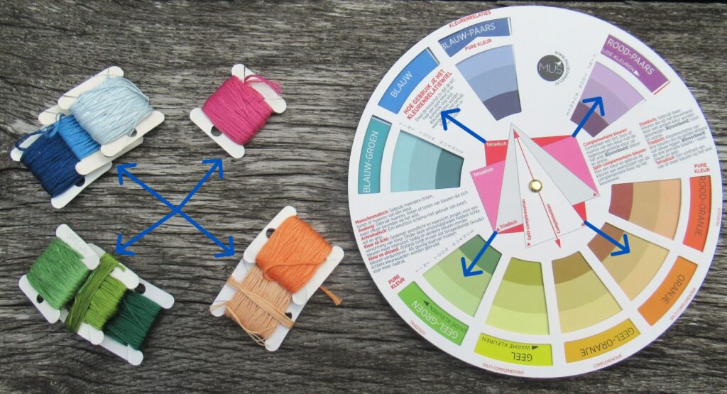
The best approach seemed to me to start with the main colour. Because the Finull yarn was just short pieces glued to the cards, I used embroidery floss bobbins in similar colours to get an idea of the effect. What if I chose blue as the main colour and followed the original Helma’s principles? I’d get something like this:
3 blues, 3 yellow-greens, 2 oranges and 1 red-violet; 2 dark, 2 light, 5 medium. Quite nice actually, but do I want 2 oranges in my cardigan? Not really.
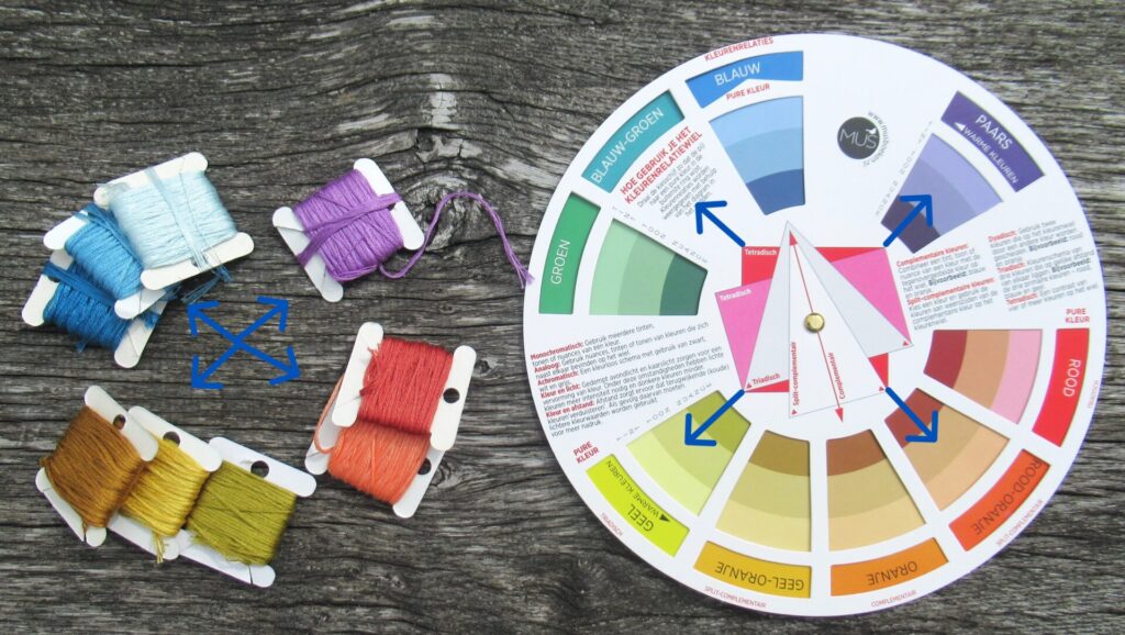
How about starting with blue-green, another of my favourite colours? Following the same principles, this would be my colour palette:
3 blue-greens, 3 yellows, 2 red-oranges, 1 violet. A really interesting colour palette, but do I want a cardigan in it? Nope. And then I asked myself the (for me) hardest question anyone can ask me: WHAT DO YOU WANT?
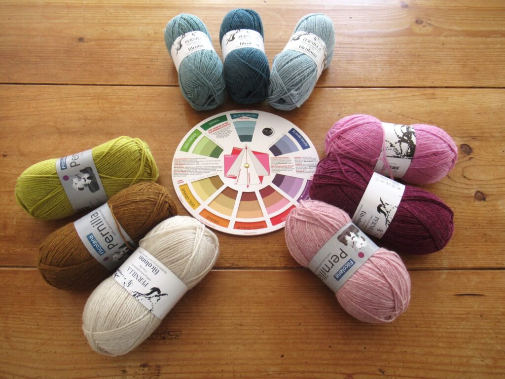
The answer I arrived at was: What I would really like for my cardigan is a soft look, with a blue-green as the main colour, a different blue-green (or white?) as the main contrast colour, and a yoke with pinks, blue-greens and white (+ a little orange-yellow?) The colour palette I came up with turned out to be triadic (using 3 different colour groups), and I made a list of Finull colours that would qualify. Only… the Finull colours were not really soft, but quite bright. So I made another list next to it with similar colours in a different yarn – Filcolana’s ‘Pernilla’.
At the yarn shop, I decided to go for Pernilla, a slightly heathered yarn in softer shades. Seeing the yarns in real life, I partly adhered to my list and also swapped a few colours for different ones. This is my final colour palette:
Well, that was an interesting exercise. Without the colour wheel, I would never ever have chosen the yellow and the brown, but I am really, really happy with them. Used in small quantities in the yoke, I think they will make the overall effect far more interesting and lively than if I’d just picked my usual ‘safe’ colours. As soon as the rest of my main colour arrives (there weren’t enough skeins in stock), I’ll start swatching and knitting. Can’t wait!
If you’ve never used a colour wheel and would like to give it a try – colour wheels are available from artist’s supply shops, and also from most bookshops nowadays. I even saw some at our nearest small book/stationery/giftshop-cum-post office, next to the adult colouring books. I hope this is helpful and all makes sense. If I haven’t explained things clearly or you have any other questions, please don’t hesitate to leave a comment and I’ll try to answer as best as I can.
14 thoughts on “Choosing Colours for Stranded Knitting Using the Colour Wheel”
Echt interessant om te zien hoe je het kleurenwiel kan gebruiken.
Ook leuk voor het verven van wol.
Prachtige kleuren heb je gekozen voor het vest.
It’s always fun to share things here – to chat about them with kindred spirits. Thank you, and I’ll let you know as soon as there is any progress to share. I’m waiting for my main colour to arrive, so it may be a while. In the meantime there will probably be something else to share. Enjoy your weekend!
Yes, it really was. And I’ll certainly share photos when there is something to show. But first waiting for my yarn to arrive before I can get started. Slightly frustrating – I hope it won’t be too long. Have a lovely weekend!
Leuk om te zien hoe je het originele palet hebt ontleed!
Kristin Wiola heeft vaak bijzondere combinaties die toch goed werken, erg inspirerend. En mooi om te zien hoe je haar systeem hebt gebruikt maar op een manier die bij je smaak past!
Love the pattern – I like the red body – I would have to tweak the yoke colors – but in reality this exercise would not be fun for me – more like a nightmare.
Haha, we’re all so different – one person’s fun can be another person’s nightmare. Fortunately there are many different ways of choosing colours. Seems to me you’re more the intuitive type.
Echt interessant om te zien hoe je het kleurenwiel kan gebruiken.
Ook leuk voor het verven van wol.
Prachtige kleuren heb je gekozen voor het vest.
Bedankt voor het delen!
Graag gedaan, en ik denk dat het idd heel leuk is om op deze manier ook eens kleuren te kiezen om mee te verven.
Oh wat goed Marijke! Wat leerzaam ook om zo het kleurenschema te gebruiken!
Mooie kleurencombinatie he je gemaakt!
Echt leuk om eens mee te spelen, die kleurenschijf. En wat een rijkdom om keus te hebben uit zoveel kleuren.
Thanks for the details. Can’t wait to see the progress. Enjoy!
Thank you, apart from the colours it’s a lovely yarn to knit with so I’m really looking forward to the many hours of knitting.
Thanks for sharing this. Great pattern and gorgeous colours you chose. Looking forward to seeing the work in progress.
It’s always fun to share things here – to chat about them with kindred spirits. Thank you, and I’ll let you know as soon as there is any progress to share. I’m waiting for my main colour to arrive, so it may be a while. In the meantime there will probably be something else to share. Enjoy your weekend!
Such an interesting exercise!! I’m hoping that you’ll share progress photos, so that we can see your beautiful choices come alive.
Yes, it really was. And I’ll certainly share photos when there is something to show. But first waiting for my yarn to arrive before I can get started. Slightly frustrating – I hope it won’t be too long. Have a lovely weekend!
Leuk om te zien hoe je het originele palet hebt ontleed!
Kristin Wiola heeft vaak bijzondere combinaties die toch goed werken, erg inspirerend. En mooi om te zien hoe je haar systeem hebt gebruikt maar op een manier die bij je smaak past!
Het heeft me wel even wat hoofdbrekens gekost, maar het was erg leuk om ermee bezig te zijn (zoals jij zeker zult begrijpen). Dank voor je bezoekje!
Love the pattern – I like the red body – I would have to tweak the yoke colors – but in reality this exercise would not be fun for me – more like a nightmare.
I can’t wait to see your sweater progress.
Haha, we’re all so different – one person’s fun can be another person’s nightmare. Fortunately there are many different ways of choosing colours. Seems to me you’re more the intuitive type.